Sunday, February 24, 2013

Monday, February 18: Distance-Azimuth Survey

Introduction:

     Professor Hupy designed this lab to both further our understanding of field methods and (of course) improve out ability to provide low-tech solutions when "in a pinch" high-tech plans fall through.  In it, we will use the distance-azimuth method of surveying to plot points of interest (of our choosing) in a quarter hectare (25 sq. meters, also of our choosing).  In teams of two, we will be using two methods to survey our points; both sets of data collected will be distance-azimuth however they will be collected using two sets of instruments.  The first data set is the combination of a compass and a radio-based range finder which is standing in for the rather unwieldy, if sometimes necessary, tape measure.  The second data set will be collected with a laser rangefinder.

fig. 1 We chose the worst time of day to go outside.
courtesy wunderground.
      Our pair paired with another pair to more efficiently split the workload: with four total members we could collect our data using both methods for each point at one time thereby cutting down on the time required in the bitter cold that was Monday the 18th, circa 4-6 PM.  By the time we were wrapping up the lab, it was 15 degrees with windchill, gusts of up to 20 mph, and snowing, not that we minded (fig. 1). 

What we felt we were doing


What we actually were doing.
Say hi to Joey, he's the one in the middle.
 
     After collecting our data we will import both sets into a GIS and overlay the data sets with a base aerial of the area covered to assess the success or failure of our endeavor. Ideally, the points surveyed with both systems will line up accurately with the aerial.  We selected the backyard area of a residence hall on campus (the area bordering both Horan and Governor's, for those curious) which seemed a good choice because of the myriad trees in the region, sprinkled with a smattering of other objects such as benches and disc golf holes to map.


Methodology:

     So distance-azimuth surveys are quite simple.  The surveyor stands on a known point, and calculates the distance and the angle to the desired survey points.  Then, inside, the surveyor can use simple geometery to determine the location of the survey points using their relationship to the known point.  Therefore, it is integral that an accurate calculation of angle can be found; the budding surveyor must have a working understanding of magnetic declination.  Because of variations in the earth's molten metal core (of which I have only the most rudimentary understanding), magnetic north constantly shifts around true north.  As magnetic compasses point toward this magnetic north, and as good geographers we want our data to be accurate against the standard true north (pole), we must calculate the angular differential between true north and magnetic north from our location on the earth.

fig 4 Magnetic Declination, courtesy NOAA.

     Luckily for we Wisconsinite compass users, this declination is rather small in the area (see fig 4 above, the line of no declination ran just west of us in 2010).  The exact declination for any loaction at any time on earth is conveniently provided free to the public by the wonderful folks at NOAA's geophysical data center with this magnificent declination calculator.  The declination at the time of our data collection was determined to be 58' W, which means that for true accuracy in collecting our azimuth the laser rangefinder must be calibrated and the compass data must be rotated that far west.
     Understanding this, we calibrated our tools and set out to collect our data.  One team member would walk to each individual point with one radio reciever/transmitter and another would stand at the reference point with the other radio transmitter, which would use the radio waves to determine distance between the two points.  The individual at the reference point with this transmitter would also use a compass to determine the azimuth to the point being surveyed.  Another person would use a TruPulse 360 Laser Rangefinder (fig 5) to simultaneously determine both azimuth and distance to the survey point, while the fourth person took down the data.


fig 5 TruPulse "Laser" rangefinders
fig 6 How the Laser Range Finders will look in the future.

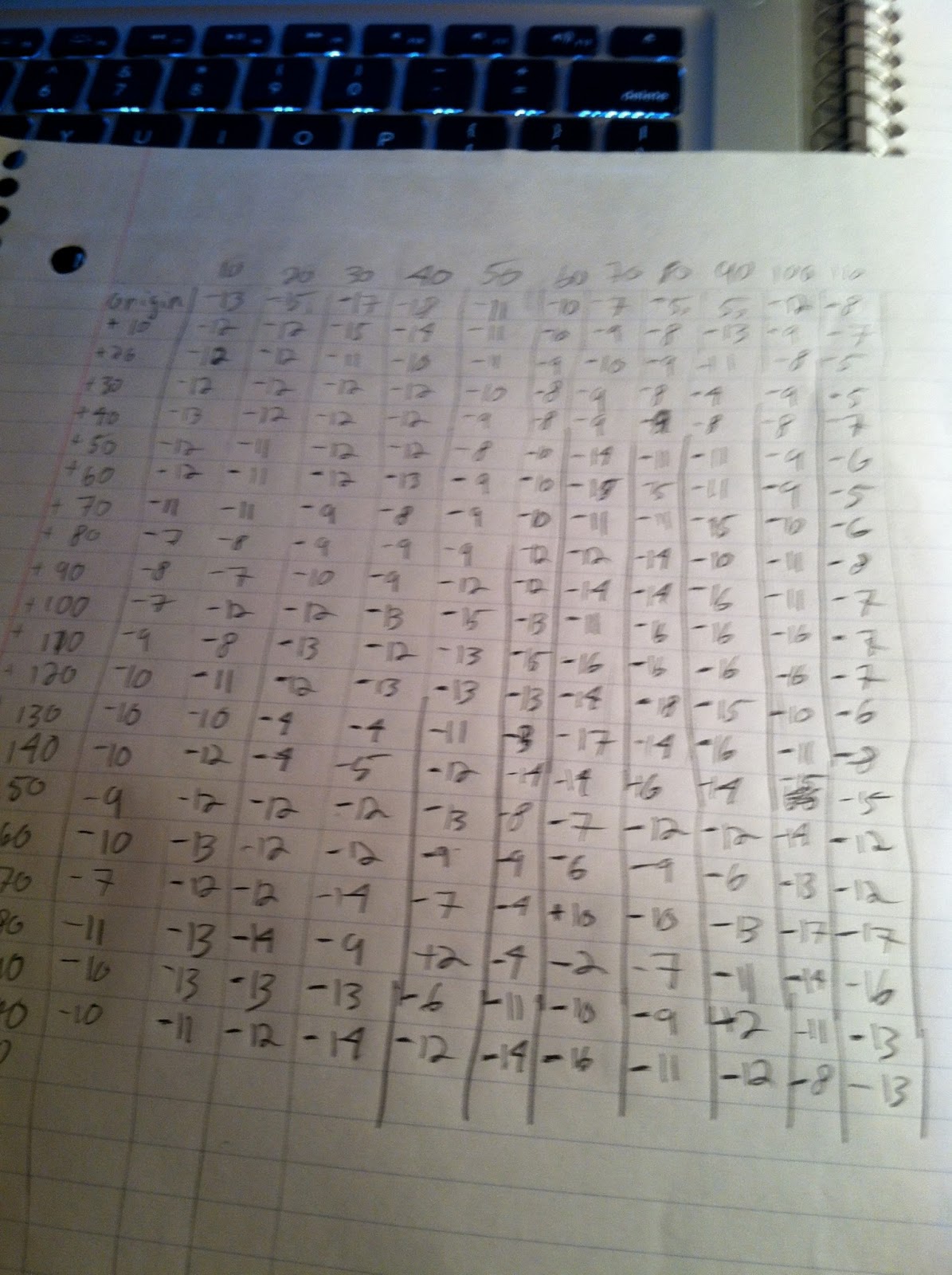
     Unfortunately, we found a few issues with our selected hectare which will be discussed later, but eventually 32 unique data points were collected using both methods.  These points were then turned into an excel file (fig 7).  A reference point was determined by using georeferenced aerial imagery and added to this file, which was then imported to our ArcInfo geodatabase.  In our case, I decided to use decimal degrees because it can be used by the computer and  while I can project the data later if needed, doing so now is not important for the purposes of this excersize.  This reference point was determined to be -91.50696 decimal degrees East, 44.79873 decimal degrees North.  Also, with each point we collected attribute data to describe what point we were collecting, for example if a point was a tree or a post or table etc, so that we can more effectively match our data to an aerial later.

     The tables were run through the Bearing Distance to Line tool, and then the Feature Vertices to Line tool provided with the GIS (under Data Management, then Features).  A nice data flow model (fig 7) for this process can be found on stackexchange, along with an explanation of the process.  Finally an unprojected aerial Basemap was added so that we could compare the accuracy of our data to a previouisly georeferenced image.  The final product is figure 9 below, I digitized some goal points for reference.  Compass and radio points are in blue, data collected by laser is in red. Unfortunately, the data do not line up especially well.  For example, point data with a more easterly azimuth were consistently farther off than other points, but more on that below.

fig 8 Bearing Distance to Line with the end Points.
fig 9 The final product, with some reference points in purple.


Discussion:

     As you can see, not only did the data collected with the two methods not match with each other, they didn't match with the terrain.  Several factors could be at play in this discrepancy: the most problematic is that some of our points lied behind other points (trees) and could not be surveyed from our reference point.  Adding a second or third reference point would probably have alleviated this problem.  Being cold and windy, and since two team members were operating without gloves, there was also a decent incentive not to collect the same data point more than needed, therefore  a few discrepancies could be attributed to user error or quick work.  Far more prevalent by the look of the map, the east half of the laser data have consistently more extreme azimuths.  It is possible that the building that we stood in the shadow of interfered with the function of the magnetic equipment used, because obviously we didn't survey our points through the corner of Horan Hall.
     Unfortunately, the spatial and temporal resolution of the image that we are comparing our data to is not very appropriate either.  For starters, in winter those trees look a lot differently than they do in summertime. One of the points surveyed was an unusually large snow pile, which of course would look more different still in the summer.  Some of the smaller features that we collected are also impossible to see, either because the resolution is too small or because they are covered by foilage.  Our quarter hectare was also too small to collect as many points as we wanted: the goal was fifty but even if we could have included the objects hiding behind each other we still wouldn't have managed that many points of interest.  And we cheated by both surveying outside of our hectare and by using fluffy points of interest, such as snow piles.
     Altogether, I am still rather pleased with our end result. I am disappointed in the lack of accuracy, however our radar/compass data was consistently within a few meters of our goal points, which is surprising given the difficulty which the radar tool would occaisionally operate with.  I would certainly have preferred to use a total station for this job.  I would have have more confidence in the preciseness and the reliability of my data, plus I could remove the step of trying to locate myself on an aerial photograph after having already collected my data.  However, by comparison I have to admit there isn't much involved in this process: one handheld tool and a recording device are all that is required to survey the type of information that we were collecting.  I like to travel light.

Monday, February 18, 2013

Monday, February 11: Balloon Mapping I

Introduction:

     This week we spent the class period developing separate apparati for two upcoming mapping projects: one for low-altitude mapping and one for a high altitude balloon launch (HABL).  Professor Hupy describes this project as 'like Apollo 13" in that we were provided with a finite assortment of materials from which to construct rigs to which we will affix digital cameras (and GPS's) that are to act as remote sensors.  The only difference is that in Apollo 13, the folks working on adapting air filters were the best and brightest engineers of a generation and in this case, two dozen undergraduate geographers are trying to send sensitive digital equipment into space and get it back in workable condition (its still not a life or death situation though).  The low-altitude balloon will be held onto by guide wires and taken through campus while a GPS tracks the location of each shot.  After collecting our images, if all goes well, we intend on patching the images retrieved together and generating some nice maps!  But more on that later, for now we need to focus on getting the images!
     As the instructions that we encountered while trying to prepare for this launch over the internet were found to be perfunctory at best,  the end goal of this week's blog is to provide detailed information on how we developed both the low-altitude module and the space module.  This way, the readers will be left with an exact account of what to do (or not to do) when trying to collect images from helium balloons launched into space.


Methods:
     Let me preface this discussion of our methods by stating that this is not a good project for young children: we did use exacto-knives, a leatherman, and a hot knife.  If you and your kids are embarking on the noble endeavor of sending some legos into space, be sure that a responsible person is on hand to do the slightly dangerous aspects themselves.
     Now, the first determination that needs to be made in developing our rigs is what we need the rig to do.  In the case of the High Altitude balloon launch, we need to have a rig that:
     - Can be attached to our helium weather balloon
     - Is light weight
     - Is stable and won't spin uncontrollably in the breezy upper atmosphere.
     - Insulates a digital camera from both physical damage and the elemental cold of the mesosphere, but still allows for the camera to take quality images on the flight.
     - Insulates and protects a GPS unit that can be used to track the end location of our rig
     - Carries and effectively deploys a parachute

The Low Altitude rig must:
     - Still be attached to a helium balloon and still be stable
     - No parachute or thermal insulation is necessary
     - Be attached to guide wires

     Fortunately, our instructor provided a rather large bundle of usable equipment, from which we selected for our launch:
     ~seven pairs of hand warmers
     ~three two-litre soda bottles (empty)
     ~Digital Cameras: TYPE Cameras will be unsing continuous shot mode instead of video as to preserve both image quality and data space limitations.  As such, we will have to rig our cameras with something to hold the trigger down.
     ~GPS/GoPro
     ~Some 1" thick styrofoam insulation
     ~One Styrofoam bait container
     ~Strong rubber bands
     ~Bleach bottle (empty)
     ~Zip ties
     ~Small Carbineers
     ~Two Weather balloons, and a helium tank provided through the University.

     Exacto knives, a small pocket knife, packing tape, and an electric hot knife (insulation cutter) were also used in the construction of our rigs.  Before any consturction takes place, an integral step in the process of developing these balloon-powered craft is identifying the weight capacity of the balloon and the expected weight of the rig.  To that end, several students diligently weighed the components of our craft as well as the final products of the high-altitude module.  Fig 1 is an snapshot of that data in MS Excel.  This is an especially important aspect of the High Altitude Launch, because the goal is to get our camera as far from the surface of the earth as possible while still having it return to us.
Fig 1: Our weight data

Low Altitude Aerial Launch:
     We garnered two seperate attempts at developing a low-altitude model, one unnamed devce (fig 2, 3) and one known as The Hindenburg (fig 4,5).  The constuction of the as-yet unnamed module
consisted of removing the bottom from the bleach container and affixing the camera to the indide with some string.  A rubber binder and pencil eraser were used to hold down the capture button on the camera; plastic wings were fashioned from the bottom of the recepticle to keep the device from spinning in the air, and attached with packing tape as seen in fig 4. The Hindenburg was formed from a two-liter bottle with the camera attached to the side with zip ties. A hole was cut from the opposing side to allow for clear images.  Both modules used string to attach them to the balloon, the unnamed module used the string attached to the container itself and the Hindenburg attached the string to some zipties strung through punchutes made at the oblong ends of the bottle.

High Altitude Balloon Launch:
     The High altitude Module is based around a strofoam minnow container with a hole in the bottom where the camera lens will poke through. COVER The camera is affixed to teh inside with string pulled through the sides of the container, and insulated by seven pairs of hand warmers.  Additionally, a styrofoam cover was cut with the hotknife to help insulate the package further and secure the hand warmers in place against the camera. It will be attached to the ballon by yarn pulled through the sides of the container near the top. Parachute?

Discussion:
    Hopefully we have provided an adequate representation of how we developed our modules. I will be updating this blog post with any modifications made before the launch of each module so that you, the internet-scouring public, can fully take our observations to heart and learn from our experience.  I also notice that we did not take exact measurements as to the dimensions of our models, and I will try to get some before we launch.  As I mentioned abover, the end goal of this batch of posts is to provide better instruction on how to develop modules for both Low-Altitude and (especially) HABL rigs than what we ourselves were able to find.  Now you have our instructions, but it won't be until next week when we get to find out how well or unwell our attmpts worked.

Sunday, February 10, 2013

Monday, February 4: Sandbox Mapping


Introduction
                This week, we are extending upon last week’s lessons by first digitizing our original findings.  After we have created some three-dimensional surfaces which try to convey our original data, we will determine how our original approach could be improved.  Using these determinations, we will embark on another survey and develop a second surface, which will be an improvement over the first if not in the quality of the model than at least in the methods used to arrive at it.  Ultimately, our group will have developed two sets of five Digital Elevation Models in an attempt to accurately portray our hand-built "sandbox" surfaces.

Methodology
                The first task of the week is the digitization of last week’s data into what’s called a Digital Terrain Model (DTM).  The immediate problem that we ran into was that the excel table of our data was formatted in the same fashion as our original data collection (image 3 last week): a table where y values are tabulated along the side and x values along the top, so that each point on the table was neighboring point that it would neighbor on the landscape (image12).  This is not useful to the GIS, and so task one was reformatting the table to x,y,z coordinates (image 2).
Figure 1: Our original data table.
Figure 2: Our second data table.

                With useable data, five surfaces that display elevation were developed in the GIS.  First, the x,y data was imported and then converted into a point shapefile (image3).  From that, four surfaces were created with the raster interpolation tools in ARCMap using spline, natural neighbor, kriging, and inverse distance weight (IDW) interpolation.  Also, a TIN was made.  The five rasters are displayed below in ARCMap, along with a brief overview of the meaning of each method.

IDW 1 
IDW 2


Inverse Distance Weighted or IDW interpolation is a deterministic tool which determines each cell's value by finding the average of nearby cells' values.  Closer cells are 'weighted' in this determination, making near cell values  stronger determinants of an individual cell's value than more distant cells' values.  The ultimate value of the cell in question is the value for that cell which minimizes the root mean square prediction error.


Kriging 1
Kriging 2

 Kriging is a geostatistical interpolation method that uses statistical relationships between values in the determining of each interpolated cell value. In addition to considering the data given, this model uses spatial autocorrelation semivariograms to determine which values are factored into the interpolation of each point.  Simply put, kriging determines weight by looking at each value's relationship to other values in addition to their relationships to the value being found.  For our model, we determined that ordinary kriging with a spherical semivriogram would be most appropriate, as there is no external variable we expect to bias our data in terms of elevation that can be defined by an equation and autocorrelation of elevation decreases substantially with distance.


Natural Neighbor 2
Natural Neighbor 1
        
Natural Neighbor interpolation works by  creating two Voronoi diagrams from the dataset for each cell: one using only nearest data points and one using the cell as an additional point. It then weights each nearest value by the percentage of that value's Voronoi polygon which is overlayed with the interpolated value's polygon.  Simply put, natural neighbor works by weighting each point not only by how close it is, but also how close it is to other points in the same direction from the cell being determined.  Doing this 


Spline 1
Spline 2


   Spline Interpolation develops a smooth mathematical curved plane, the function of which fits each input data point perfectly and therefore produces a continuous surface devoid of artifacts.  It usually does better with surfaces that don't contain coarse variation than with regions of varied elevation, because this model will be warped by concentrated variations in input points.


TIN 1
TIN 2


       Triangular Irregular Netwroks (TINs) are simply digital triangles drawn between nearest data points. Which points are connected by the edge of a triangle are determined such that no vertex lies inside the polygon of another triangle. 


                 Once the rasters were complete, a we determined the most effective interpolation methods for our data to be Kriging and Spline.  3D Elevation models were developed for the five models by importing the rasters (or TINs) into ArcScene and setting the base height to the surface of the elevation values assigned each cell.  After playing around with a little symbology, what we ended up with for our Spline and Kriging models can be seen below. 
Spline

Kriging
Conclusions
                 In my opinion, the Kriging model best represents our data of the five DEMs which we developed. It is the only model which allowed for the mesa which I had hoped to digitize which was surprising to me (in the upper left region you will notice a brown hump with a somewhat flat top). It also contained the best ridge between the large mountain and its northwest neighbor. The Spline model was too smooth, where our terrain was very rough. IDW was a very sperical model which poorly represented the more linear, continuous features such as the aforementioned ridge and the trough (which none of the models performed well with, probably because our sampling method in data collection was poor) and natural neighbors split the difference between IDW and Spline.  Because of our sampling, the TINs were simply too rough, the trinagles too large to be of much value when compared to the raster-based models.

               Our original data collection in both models was very course.  Collecting a higher number of points, especially in areas of greater elevation, would have certainly helped out models achieve greater consistency with our original surfaces.  However, no amount of hand-determined data collection is going to remotely rival the results that are achieved with LIDAR.  As other groups have discussed, the weather was of course a factor involved with our execution of this exercise: in the future our data collection will likely involve a visit to accuweather and a warm pair of gloves.  Professor Hupy suggested that it may be prudent to have the person writing down the data points remain inside and have the information radioed the outside, as to avoid them having to sit there with their writing hand exposed.  Our group had the fortune in both collections to avoid the coldest of the weather during each week; however in cases where we would not be so fortunate, or where we would have to survey something further from the comfort of indoor heating, I would certainly consider that option. In some scenarios, I might have to.

Ultimately, I would think that which DEM works best for one’s purposes depends on what those purposes are. I am personally partial to the Kriging model because I found it’s representation of our data to be the most accurate, but I honestly only have a basic grasp on how it works. Clearly, it would be more effective for data that has some "directional bias," as ESRI puts it, such as a prevailing wind or geologic flow.  Spline is extremely smooth by comparison with even the Natural Neighbor and IDW methods, and may work best for continuous surfaces that don't have extreme values that must be accounted for in the model.  Natural Neighbor and IDW seem to work in very similar ways to one another, being derived from an average of weighted neighbors.


Discussion
                It would have been nice to compare the elevation data from select points on the DEM’s to the original surfaces, but in both surveys our land was destroyed well before we were finished building the models.  It would also have been interesting to take some more precise readings with remote sensing equipment and compare DEM’s developed with those methods to our rudimentary, low-resolution meter-stick method. I also would have liked to have had a grounding in the various interpolation methods used before trying to decide on how to use them.  ArcHelp is wonderful, make no mistake, but spatial interpolation is perhaps a topic in which I could have used a little more priming. In fact, ArcHelp itself mentions in the Kriging page that the process is more complicated than they have the space (or perhaps more appropriately patience) to really get into.
I am lucky to have a group that works well together.  One of our members couldn't be there for the lecture and lab in which we discussed how to make these 3D models happen, but we made it work and all three of us have now used several methods of raster interpolation to create 3D Digital Elevation Models.  We completed the projects relatively quickly and without getting too frustrated, mostly, which when exploring GIS in sandbox mode really says something.

Monday, February 4, 2013

January 28: Sandbox Survey

Introduction:
   Welcome to my geography field methods blog, where I will be documenting my progress in this course through the spring. This semester begins with a "sandbox survey" in which teams of three-ish were sent out into the world to develop our own terrain, and then were made to survey it with naught but chutzpah and yardsticks. I lucked out and got a team with both in spades, so we managed to clear away task one with time to spare.

Methodology:
    First, we developed our landscape in our sandbox. Below (image 1), I am making some of the terrain that we were soon to survey. In order to simulate real life conditions, in the event that we students ever need to use the Yardstick Method in the field, it was important that our icy wasteland featured mountains, ridges, valleys, troughs, hills, and plains. After our artificial Hoth had been fully constructed, we divided the total area into a grid of 10 cm2 cells, 11 long by 20 deep (or 110 by 200 cm total). We began taking data at the origin of the lower left corner, and proceeded to record depths along the lower border of our constructed land.

Image 1
 

   Using the metersticks provided, we recorded 220 heights across our field in the freezing cold. Below is an image of the grueling process, props to Joey for being tough enough to not only taking down all those numbers, but doing so without the aid of any hand protection. This lovely action shot comes courtesy of Chuck, who did much of the measuring as well. In the end, we are going to import our data to a GIS and digitize the x,y data to formulate a 3-dimensional surface.


Image 2
Image 3


Conclusion:
   I also need to thank Joey for digitizing those notes, creating the ultimate excel data file which we will use this week to bring our rudimentary data into the 21st century. Naturally, the manual data collection will ultimately provide a less than stellar representation of the real fictional world that our team developed, because a) the aerial units used to record our data are still quite large relative to the size of our terrain, given the variation within that terrain and b) our terrain swiftly proceeded to melt, and then be snowed upon. It is quite possible that there is not much topography left in out sandbox.  However, the dynamic landscape that was developed will be immortalized through the wonders of modern technology as this coming week we leave the meterstick behind for some fun with the GIS.